Should I Have My Logo Redesigned?
The question of the century to every business owner who needs to keep up with the ever changing current times. The 5 most common reasons I find where business owners often shy away from a logo redesign / refresh are:
- Cost – It isn’t just the cost of the logo, it’s web updates, it’s redoing business cards, all print material, and signage (if any). If you are a huge company, this can cost millions. If you are a small business owner, then you are lucky.
- Fear – that their current audience may not remember who they are.
- Backlash – Like these 5 examples here.
- Stuck in 1980 – just can’t seem to let their baby go.
- Unaware – unfortunately some clients just don’t know that their logo is unattractive.
When should a logo be redone?
- If it has more than 3 primary and secondary colours.
- If it has beveled edges.
- If it has drop shadows.
OK, OK, I’ll be serious.
- If you feel that your logo is outdated.
- If you feel that it’s time to refresh your brand.
- If you are changing the direction of your company or merging with another.
- If you are considering getting a new website or updating the look of your website.
If you are unsure, ask a few professional logo designers for their thoughts.
Can my new logo affect sales?
I must confess that I once made a decision NOT to buy a certain refrigerator because their logo was ugly. Not only was the logo ugly, but it was gold. And the thought of seeing a gold plated logo branded on the top right face of a stainless steel fridge every single day for the next 10 or so years made me not want to go into my kitchen ever.
But of course, my brain is not typical of any other person (or so my husband says). But my personal answer to this question is definitely a BIG YES.
Changing your logo doesn’t just stop there.
It’s like going to a wedding and getting your face all made up, but not bothering to do anything with your hair. Yes, your logo is the foundation of your brand, but don’t just leave it there. Consider ALL your branding. You will need to give your website a similar facelift to match.
Nothing makes a designer more happy then when their client says “Yes! please freshen up everything!”. I feel sorry for the designer who has a new blank canvas for a website, but working with a really outdated logo unable to convince the client that a refresh is necessary. Been there, done that. It feels like a case of the Mondays.
Things to consider before you go under the knife.
Of course, a lot of factors come into play before you can make a decision like this. How old is your company? 5 years? 10 years? 50 years? How many employees do you have, 3? 25? 1000? Are you an internationally recognized brand with millions of followers? Or a local business? Are you willing to take the risk and put your brand loyalty on the line? Depending on your answers, it could significantly drive up your cost.
What if my customers hate it?
You can’t please everyone. Expect to hear from the naysayers. There are always opinionated haters EVERYWHERE and you cannot avoid this. My advice is to find a really really good and talented Logo Designer whom you completely trust to redo your logo. He/she will give you a few options to choose from and you can tweak things as you go along. Go with your gut. If your gut is untrustworthy, trust your very talented logo designer, whom obviously, you hired for a reason.
Please, don’t ask your Aunt what she thinks. Unless she is a really good logo designer.
Case Study from Logos by Nick
I recently reached out to Nick from Logos by Nick to see his thoughts on this matter. He sent me an example.
This client liked the concept behind the logo they already had, but it needed to be executed better. That’s where I came in. I took their original idea and produced a more refined, professional-looking iteration of it. Even if you have a great idea of your own, sometimes it’s best to reach out to a professional so they can work with you to bring it to life.
10 Established Brands Facelifted
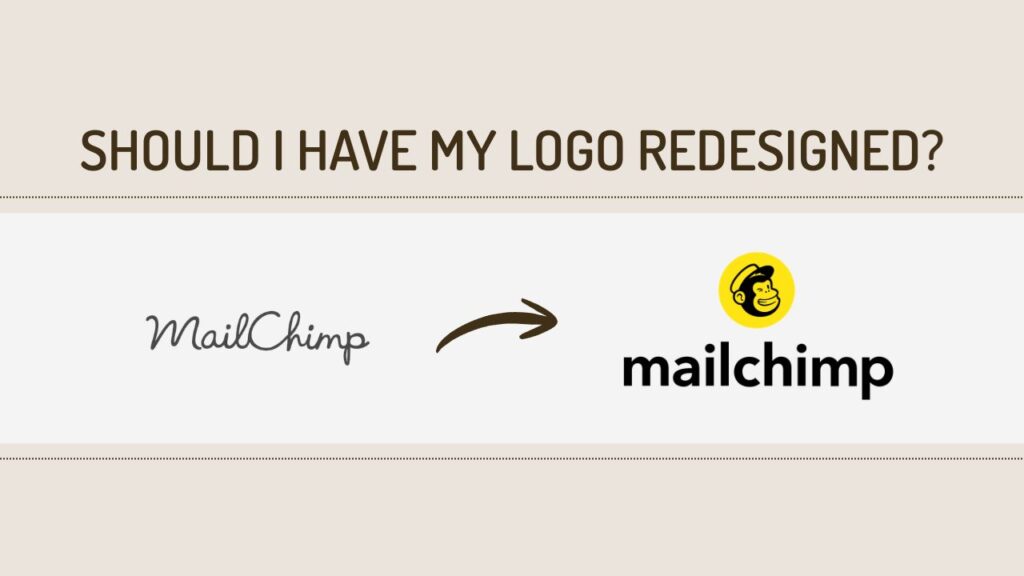
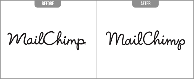
1. MailChimp
One of my secret crushes and the greatest Letterers of this era, Jessica Hische, who recently restored MailChimp’s logo. You can read all about her process here.
And then they redid it again. Thoughts?
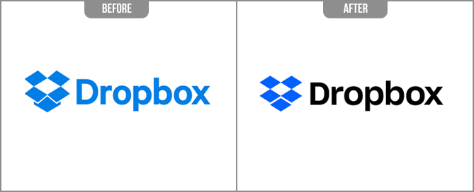
2. Dropbox
Subtle facelift, icon much simpler using same shapes, darkening of the blue and differentiation in colours.
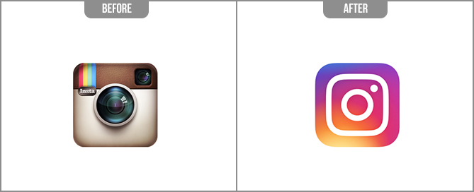
3. Instagram
While the original logo was probably effective in its inception, the redone logo is much simpler obviously. I wonder if they would ever make it a complete flat colour?
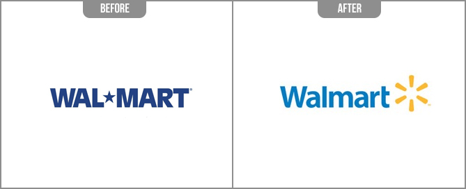
4. Walmart
Walmart’s redesigned logo includes a yellow “spark”. This logo does seem more refreshing with brighter colours, and almost does away with the “cheap” brand. I say almost.
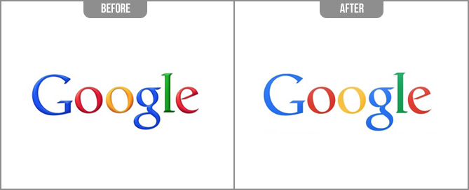
5. Google
Google is a necessity in life, kind of like water and food. I feel very insignificant even bothering to make a comment, (because you know, they really care about my opinion). But 1999 called and they want their beveled edges back (I was once notorious for this feature at one stage, if I could have beveled my cat, I would have).
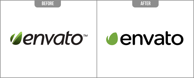
6. Envato
I have been using Envato for years, they are great. I love their change, they opted for a cleaner look, flattened the icon, got rid of the italics and chose a more rounded sans serif font.
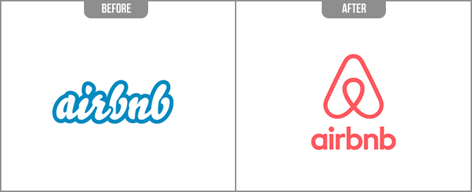
7. Airbnb
This is a definite blow it up, chuck it, 100% let’s redo this. Underconsideration.com has a great heavy and detailed write up on why Airbnb decided to make this change.
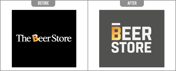
8. The Beer Store
Their logo has bothered me for decades, especially seeing their signage everywhere I drove. It was unattractive for so many reasons.
- The mix of the thin Serif against a thicker Sans Serif. Complete opposite ends of the spectrum.
- Don’t even talk about the kerning between the “B” and the “E”.
- The “B” on an angle while everything else was straight (Yes I realize the “B” represents a cup of beer that’s tilted back, at least I think that’s what it means).
This logo is a complete enemy to any person with traits of OCD. Nothing is cohesive, balanced, lines up or matches.
Their new logo? Meh. I don’t get the line above the B, and I’m not too big a fan on the square font. (See there are haters everywhere, can’t avoid ’em).
The plus for them I guess is that they aren’t following the typical Beer Logos that seems to be taking over the planet. And I guess I shouldn’t be making fun of them, being a Canadian and all.
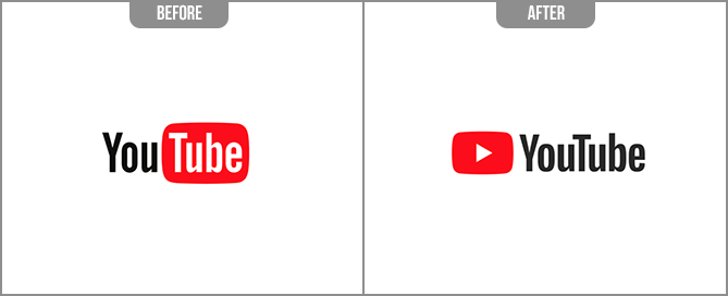
9. YouTube
Love how they swapped it out and made it into a Play button. My 2 year old now even knows what to press now since he is on it 12 hours a day.
10. Amazon
I didn’t even notice Amazon’s re-design until one day, I ordered something online and screamed at my husband for suddenly noticing their new arrow. “Oh my goodness Husband! Look! Did you see how Amazon’s logo says they have everything you need from A to Z?”.

Ready to have your logo redone?
When a client comes wanting to redesign a website, and I feel that their logo doesn’t fit this era, I will gently ask if they want to “freshen” it up. And then I cross my fingers and hold my breath. It doesn’t mean throwing it in the trash completely, but giving it a refresh. This can include more appropriate use of fonts, use of colour, streamlining any icons associated with the logo, etc.
Remember to consider everything that comes along with redoing your logo. Even the smallest of changes can have a domino effect if you are an established brand. Like doing a bathroom reno. You want to change the toilet, but then you might as well change the sink to match, and figure if you are ripping up the floors, you might as well re-tile it and then you end up with a complete gut and $18K later.
I’m not trying to scare you, it’s an exciting adventure, and if everything lines up right, I say go for it! But have a plan ready to accomplish this. Your designer should be able to work with you by exploring all avenues of the redesign.