Design a Banner that Stands Out
In my previous post, I discussed which Web Banners are Considered the Top 5 Most Effective Sizes according to Google. In this post, I will show you how to effectively design a web banner that is both eye catching and one that will get your message across.
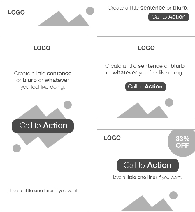
Seeing that you have very limited real estate when it comes to your web banner given by the sizes, you need to keep it really clean and simple. What is the purpose of your web banner ad? Is it a promotion that is going to expire? Is it an ad for your services or product? Consider everything you put on there. The 4 elements you need in any web banner ad are:
- A really good logo – I cannot stress this enough
- An image – most preferably a clean looking background image
- Text – max 5-10 words
- Call to Action
Ugly Web Banners
Let’s start the conversation off first with what NOT to have on your web banner.

Do NOT have/use:
- more than 3 colours main colours
- your nephew to take your photo at Thanksgiving dinner as a profile picture
- heavily skewed star clip art with inner glow
- blue links that scream 1997
- beveled rectangles, squares and circles
- stretched fonts
- CGI women with transparent eyes
- save your .jpg with a 2 quality. Figure out a way to have max quality with low file size (150 kb). Image loss due to compression like flat reds, blues and pinks are more noticeable to the eye, especially around the edges of the text (see example above).
Reverse Psychology?
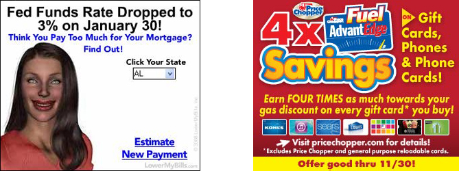
There are some schools of thought that think the uglier your web banner is, the more clicks you will get. Here’s an example below {source}.
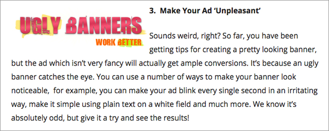
As a designer, I’m not so sure if this approach is for me. Granted, it does work, and there are sites that have proven to make millions from ugly design (ahem Ebay). But again, you need to figure out what the purpose of your banner is. Clutter to me screams spam. And if I click it, my computer will get hacked and then gawd forbid, I lose all my files. Not to mention the constant flickering ads gives me headaches, so the first thing I will do is probably close that site.
BUT. And that is a HUGE BUT, you could probably get away with an effective ugly ad like this. This one seems almost intentionally ugly rather than just bad design and I would have clicked on it because it would have peaked my curiosity. Most likely because it’s simple ugly versus cluttered ugly. But if you read his story, you have to pat him on the back for a well played campaign. You see, low expectations always gives you surprising results.
Effective Web Banner Design Tips:
Functionality and Purpose:
- Above the Fold: Place your web banner his is the area where users see first without having to scroll.
- File Size: Keep your file size to about 150kb or below.
- File Formats: JPG, PNG, GIF, HTML5
- Say No to Flash Animation: Google AdWords has stopped running display ads in the Flash format. You will need to convert your ads to HTML5 if you have ads already done in Flash. Click here for Google’s tutorial.
- Logo: Include your logo (if advertising on another site) prominently displayed. If it’s for your own website, you don’t need to use it.
- Text Copy: Do not put more than 1-2 sentences of accompanying text depending on the size of your banner.
- Call to Action: Make this a button and make it crystal clear with as little words as possible such as Try Today, Try Now for Free, Call us Today. Remember, the shorter the better!
Design Esthetics
- Background Images: Have one image only as a background. If you do not have an image, consider using no more than 2 colours (that compliment each other) for the background unless you are having a white background. Go to Adobe’s Color Wheel to get colour themes. If your background is just white, have a border (this is a requirement for Google Ads because your ad needs to be separated from the main site so as not to look as part of the website. This is only applicable if you are advertising through Google).
- Brand Consistency: If you are designing multiple size banners, consider doing them in the same theme for continuity of brand.
Design Composition
Below are examples of the 4 elements that should go in any web banner. Logo, Image, Text, Call to Action. Do not clutter up your design!
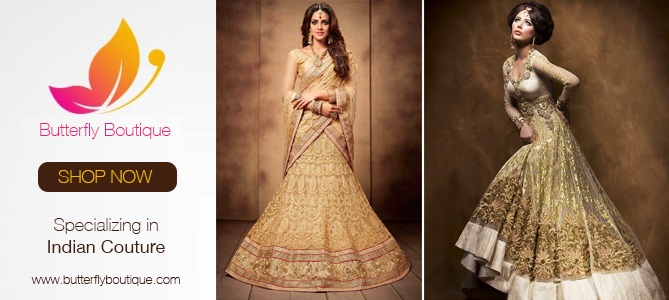
Here are Some Fake Web Banners that I Designed
Nothin’ like keeping it simple to get your message across.