CMYK vs SPOT COLOUR: Which one should you use?
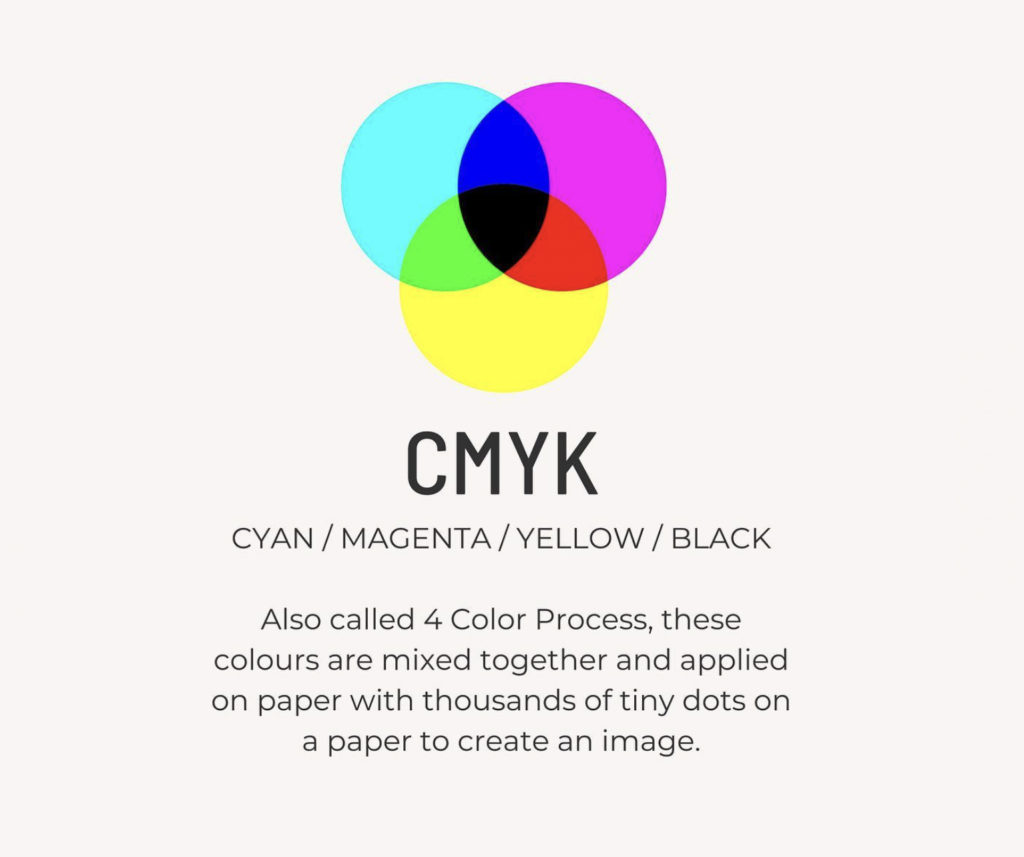
CMYK – CYAN / MAGENTA / YELLOW / BLACK
Also called 4 Color Process, these colours are mixed together and applied on paper with thousands of tiny dots on a paper to create an image.
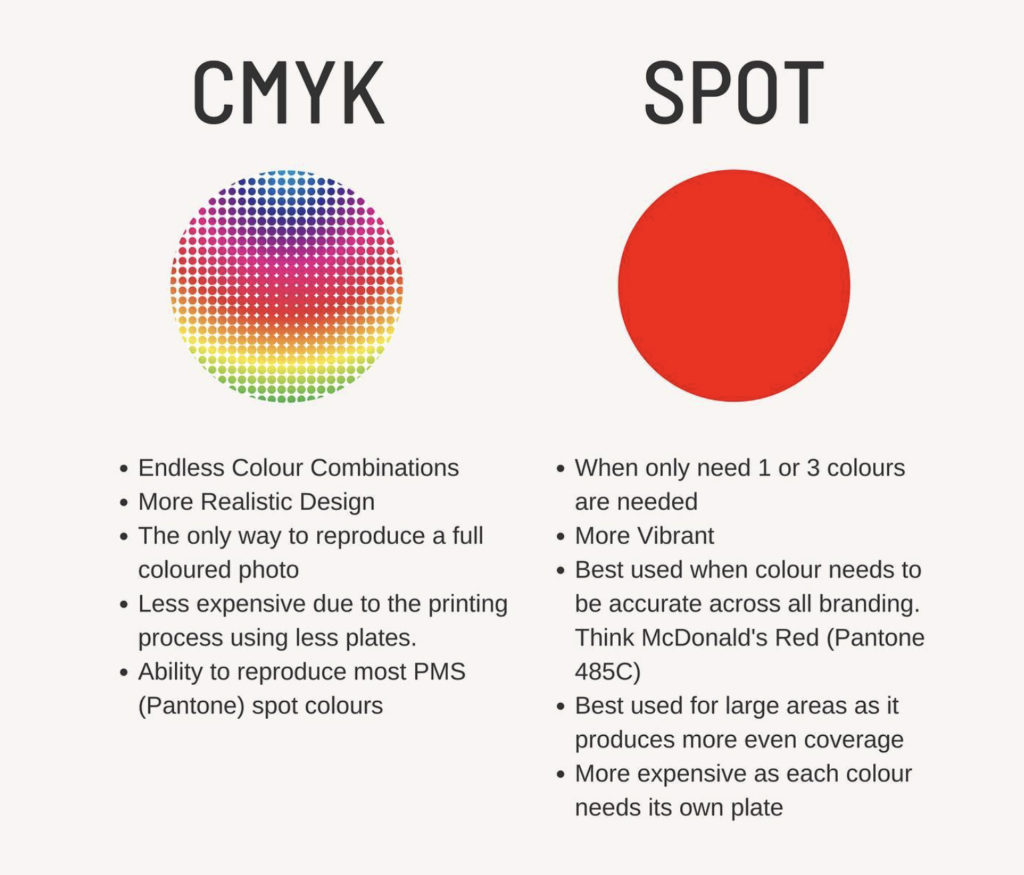
- Endless Colour Combinations
- More Realistic Design
- The only way to reproduce a full coloured photo
- Less expensive due to the printing process using less plates.
- Ability to reproduce most PMS (Pantone) spot colours
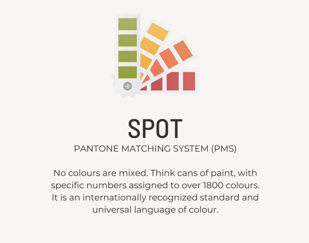
SPOT COLOUR (PANTONE MATCHING SYSTEM / PMS)
No colours are mixed. Think cans of paint, with specific numbers assigned to over 1800 colours. It is an internationally recognized standard and universal language of colour.
- When only need 1 or 3 colours are needed
- More Vibrant
- Best used when colour needs to be accurate across all branding. Think McDonald’s Red (Pantone 485C)
- Best used for large areas as it produces more even coverage
- More expensive as each colour needs its own plate
COMPARISON
CMYK
Best used for photographs or where realistic outputs are needed.
SPOT COLOUR (PMS / Pantone Matching System)
Best used for logos or text or artwork that only requires 1 – 3 colours.
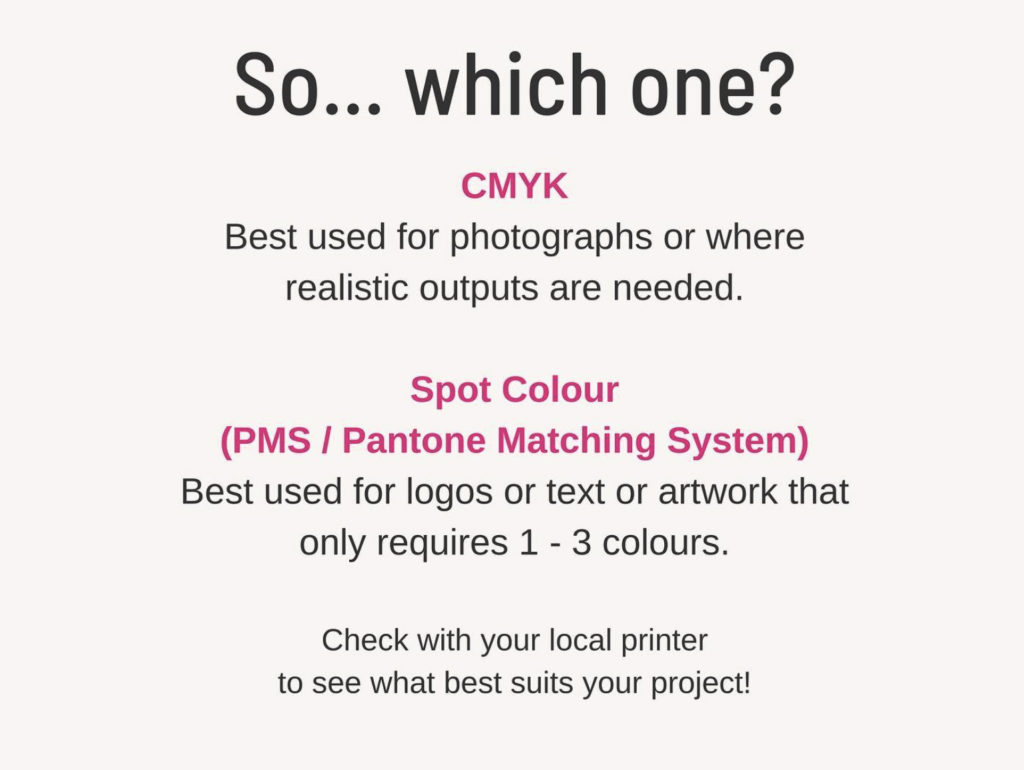
Check with your local printer to see what best suits your project!