Serif Vs Sans Serif
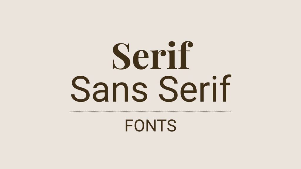
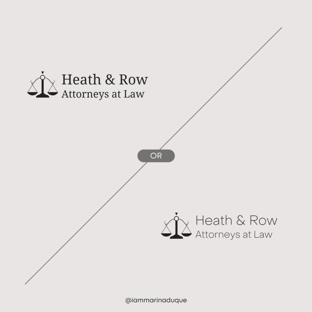
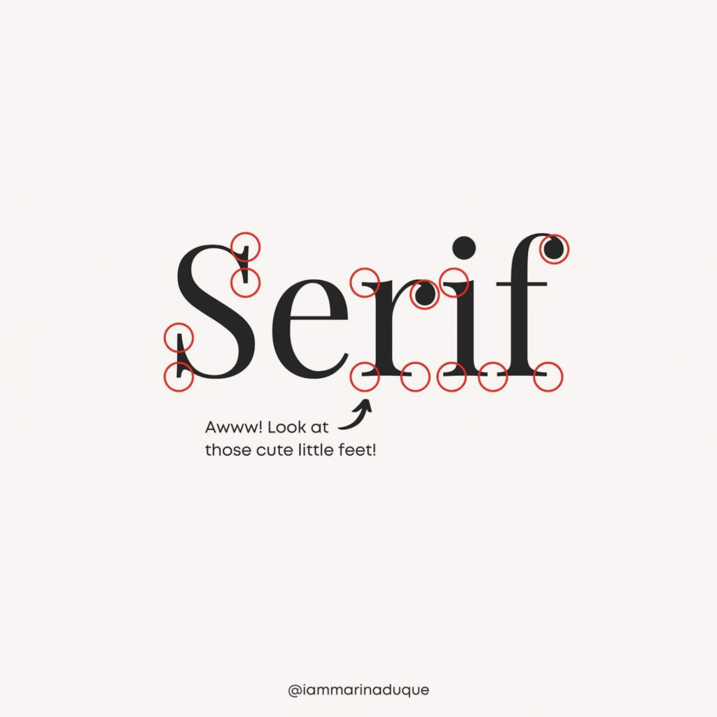
Serif and sans-serif fonts are two distinct typographic styles that differ in their appearance and usage. Serif fonts are characterized by small decorative lines (serifs) at the ends of characters, such as Times New Roman or Georgia. These serifs create a more traditional and formal feel, making them suitable for printed materials like books, newspapers, and documents, where readability and legibility are paramount.
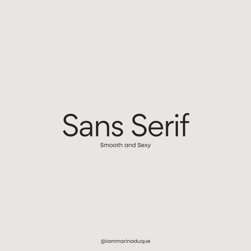
On the other hand, sans-serif fonts, like Helvetica or Arial, lack these decorative lines and present a more modern and minimalistic appearance. They are often preferred for digital media, websites, and screens due to their clean and straightforward design, enhancing readability in smaller sizes and on low-resolution screens.
The choice between serif and sans-serif fonts depends on the context and the desired visual impact, with serifs conveying a classic and elegant impression, while sans-serifs evoke a more contemporary and streamlined look.
Which type of fonts do you usually gravitate to? Why?