Is Your Ad Design Ugly?
Is your ad design ugly? What truly makes a great design? An effective design or ad is not just all about looks.
There are 3 main components when designing anything whether it be a simple web banner, a lead sales page, a corporate brochure, or even something as simple as a business card.
- Message
- Delivery
- Aesthetics
Message
Define crystal clear what message you are trying to convey. Do not leave anything up for assumption. Why? Because people don’t have time to waste and by 8 seconds, they would already have moved on. Is this sad? Yes. But that is the society we live in today. And my attention span is worse. If you don’t have me at 3 seconds, then I’m out.
- Define who your target audience / demographic is:
Are they moms with babies on their hips, running around doing groceries daily, gymnastics and hockey? Then you will probably have less than 3 seconds unless they have a vested interest in your service or product. Are they retirees looking for a new adult only condo development? Then you probably have an advantage with this, because they are older and have greater attention spans. Consider who your audience is and how they will respond to your message.
- Does your message come across quickly and effectively?
Does your audience need to figure out what you are trying to say? If you are designing a web banner, you have very limited real estate, so make sure every pixel counts! If you are designing luxury spa price sheet insert, include ONLY the relevant information and avoid cramming in unnecessary information. Remember, LESS is MORE!
Delivery
Are you trying to be serious, laid back, fun, witty, or gimmicky with your ad? I would test run your ad campaign by friends, family and even several strangers (for example, Facebook groups). Even though you may think it’s funny, others may find it offensive or cliche. This COULD be a good thing though! It gets people talking! But could end up with some negative press for you. This is definitely a more riskier route.
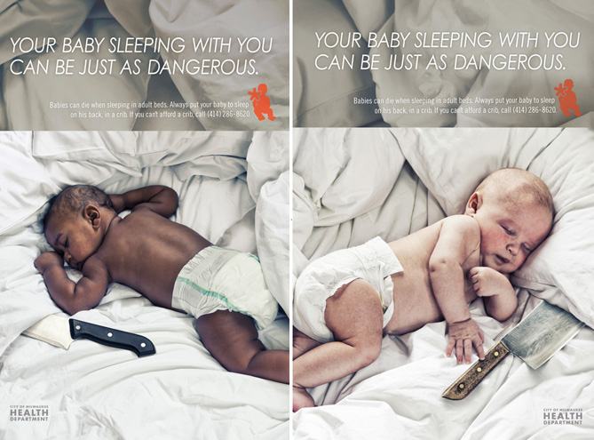
This ad above has 3 target groups:
- Parents who don’t believe in co-sleeping.
- Parents who do believe in co-sleeping.
- Future parents to be.
Indeed, this ad had caused some controversy.
- Is the message clear? Yes.
- What about the delivery? Well, that’s up for debate.
- Is this an effective ad? Yes.
- Did it get people talking? Yes.
- Did it make some people angry? Yes.
And for the record, I co-slept/sleep with both my kids, and get ready to pull your pitchforks out, because they also slept on their stomachs. And guess what, they are both fine, but that is a whole other blog.
But let me tell you, this ad is only effective for:
- Parent’s who don’t believe in co-sleeping, because it is validating that their parenting method is good.
- Parent’s to be, who will now live with fear that their baby will stab them in their sleep if they co-sleep with them.
The purpose of an advertisement is to convince their target audience that what they are selling (service, product, message) is the best thing ever. Their target audience in this scenario, were the parents who DO BELIEVE in co-sleeping with their babies, which they have now offended. Do you really think these parents are now going to run home and put their babies back in the crib? Hell no!! This ad just accused them that co-sleeping with their babies is equivalent to sleeping with a knife! (or, the baby is going to pick up that meat cleaver and stab them in their sleep = which is it? message not clear).
This ad was completely counterproductive and just alienated their target audience. All it did was make them angry. And you DON’T want to mess with moms.
My Rating: Clear Message, Poor Delivery, Ok Design.
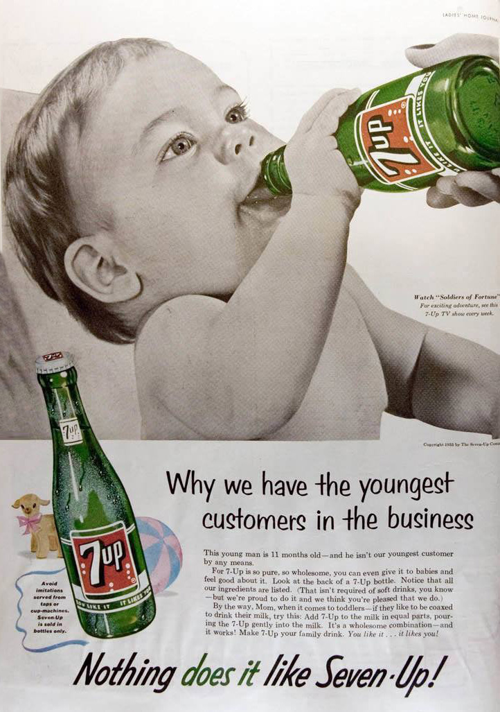
How about this one below?
Funny? Yes.
Offensive? Probably to about 50% of the population.
But who cares, it’s funny.
My rating: Clear Message, Great Delivery, Great Design.
Aesthetics
Got your message? Got your delivery? Now, tie it all together. How do you bring your message to life? Definitely not like below.
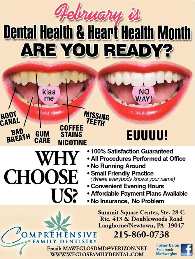
What on earth went wrong with this design?
- Too many fonts with italics, serifs and san serifs.
- Upper and lower case used throughout, inconsistent.
- Nothing is lined up.
- No breathing room on margins.
- Terrible use of drop shadow.
- Terrible use of outer glows.
- Why does the mouth with white teeth say NO WAY? and “EUUUU?” Wouldn’t you want to kiss a mouth with white teeth? Message not clear.
- Same mouth picture on both left and right. The left just had Photoshop color yellow teeth.
- Mouth on right is all caps while mouth on left is lowercase. Inconsistent (Don’t forget! Copywriting!)
- EUUUU is spelled “EWWWW”.
- You shouldn’t use all caps for email and website.
- Horrible cut job of mouth.
My Rating: Some stuff isn’t clear in the message, Delivery (N/A), Horrible Design
How about this one below?
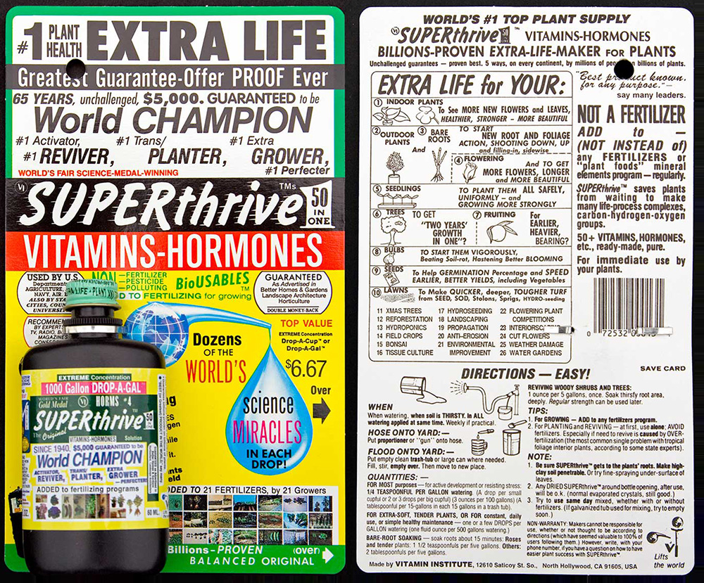
I thought it was a vitamin hormone supplement for humans until I saw the plants on the back, which was about 20 minutes after continuously looking at this image for consideration of this post. I also asked my mom, who is an avid gardener what her first impression was after 5 seconds. She also thought it was a human hormone food supplement and said it was too busy and she would probably have passed by it in the store because her attention span can’t handle it.
What is wrong with this product label?
- Who/what is this product for? Humans or plants? If you can’t see that in 5 seconds, something is wrong.
- Everything is being crammed in here but the bowling ball and kitchen sink. Well, wait, there IS a hose on the back of the label.
- I believe that the actual product is affixed to the label as shown on the bottom left quadrant. This is clear that the product label designer didn’t take into consideration that the product will be covering up 1/4 of the message.
- Red, Green, and Yellow: Screams cleaning agent to me. CLR anyone?
- There is just way too much information that I don’t want to read it.
My Rating: Horrible Message, Delivery (N/A), Horrible Design
Ok. So I am not here to bash these companies. I am hear to help and that is the purpose of my website. After doing a little bit of research on this last one, it does have a long history. Dr. Thomson invented SUPERthrive in 1939 and he sounds like a lovely person who has made a difference in many people’s lives. I see many rave reviews about his product on their FB page, so it is no doubt that this product is selling through word of mouth, and its history in the marketplace.
My next post will be a case study on this ad, and how to make it more appealing, both visually and information wise. Stay tuned for my next post in my Design 101 Series on How to Design a Product Label!