Case Study ~ Creating a Product Label Design
Going back to my last post on where I ask If Your Ads are Effective, this post will now show you how to bring your message to life through design. Taking the product label from my previous post, I am going to redesign the front of the label only.
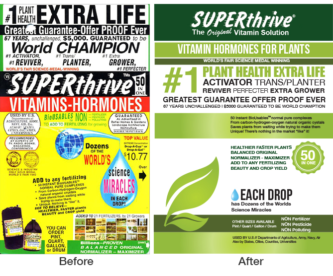
As mentioned, the problems with this design was complete information overload . This needs to be streamlined and alot of the information should be housed on their website and is not necessary on the product label. So, what are the most important pieces of information?
Front of Label
- Logo – This itself proves to be a design challenge
- What is the product and who is it for?
- Key Features
- Directions
- Awards
- Leave room for the actual product
- The actual price shouldn’t be on a label just incase you decide the change the pricing later on, you don’t need to re-print thousands of labels.
Back of Label
- Instructions
- Bar Code
- Website
- Maker
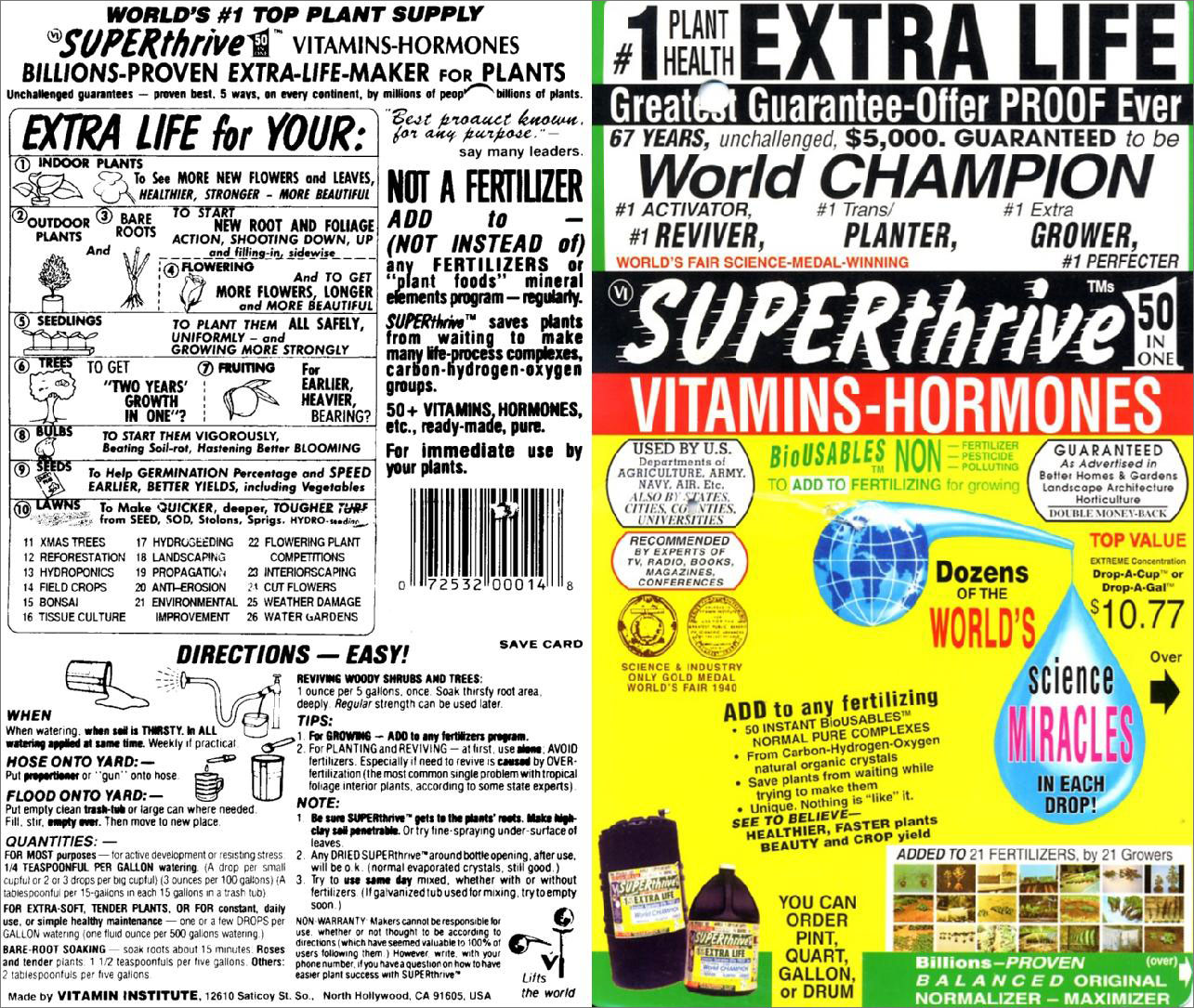
Just as a note, there were several challenges when I attempted to redesign this. This was mainly grammar, words didn’t make sense to me, etc. Some of the credentials like the awards and badges were of very poor quality, so I left this out. Lastly, the logo also proved to be a challenge from an aesthetic point of view.
Step 1: Confirm Everything
Let’s assume that this is a 5 x 7 double sided product label. Make sure you confirm the dimensions with your client (unless you are designing it for yourself), because you don’t want to have the wrong dimensions and resize everything. The best program to use is Adobe Illustrator, Adobe InDesign, or any other vector based software program. Ask your client for the text copy and to confirm the text copy.
Step 2: Figure out your Color Palette
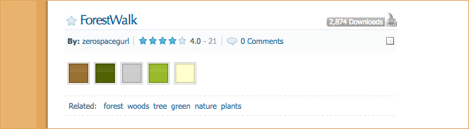
I went on to Color Schemer and picked this one.
To get the colors, open this up in Photoshop, use the eyedropper tool and get the hex color codes.
#154b25 – This is the green from their logo.
#000000 – Black
#9a7032
#506303
#cccccc
#98ba2a
#ffffcc
You may not end up using all these colors, but it is a good palette to keep in the file.
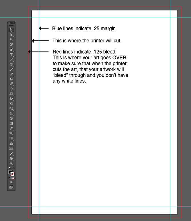
Step 3: Set up your Margins
Select 5 x 7 dimension, include a .125 bleed all around and set up your margins to .25 all around.
Step 4: Design Away
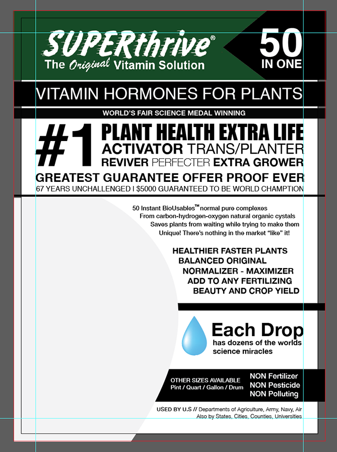
Make sure you use a grid format when designing. I will discuss that more in my next post. I have made everything black and white with the exception of elements that cannot change. a) their logo b) the water drop, which I know will stay blue.
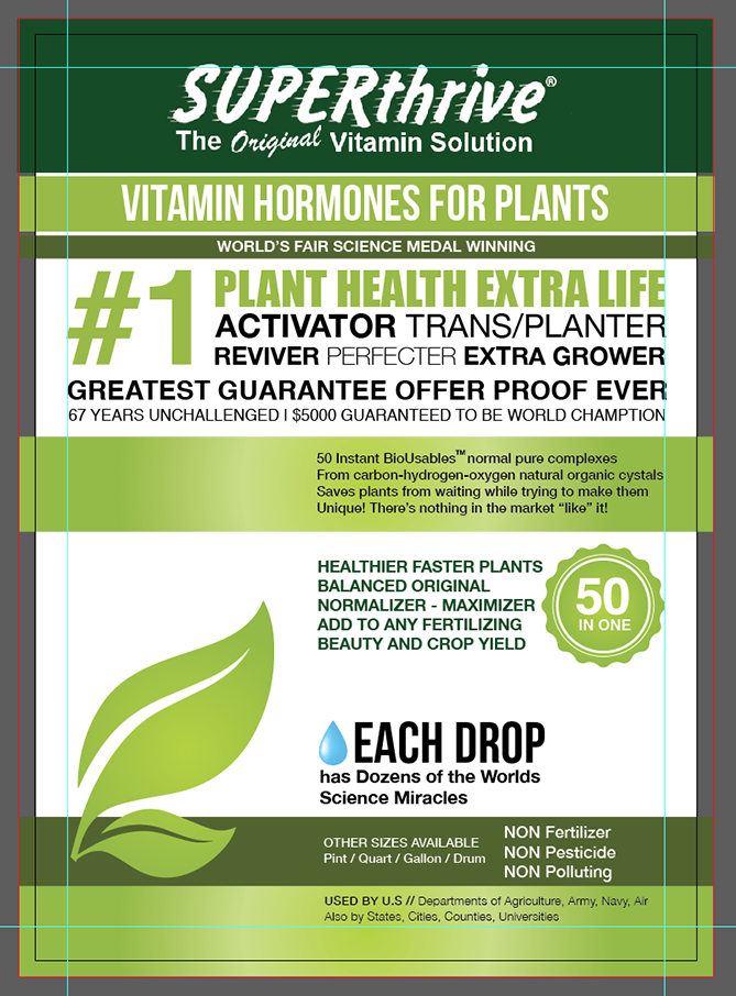
Step 4: Apply your Color Palette
I also changed my mind about the layout and did this instead. There is room for the product in front of the leaf on the bottom left.
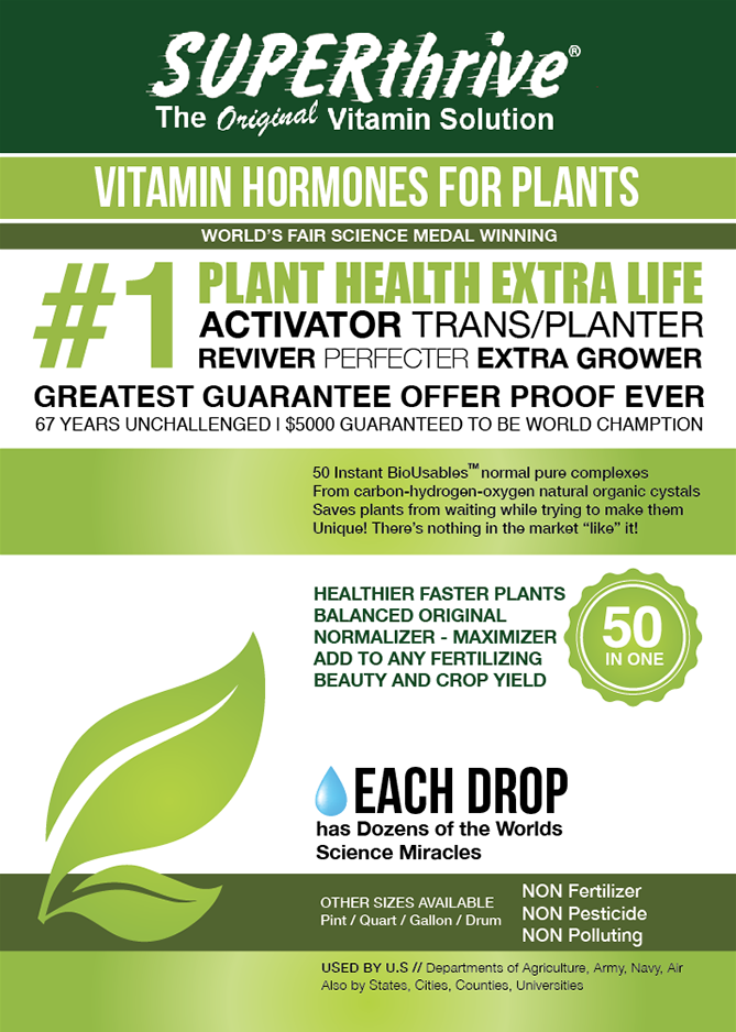
Final Design.
Here’s a mockup with the product.
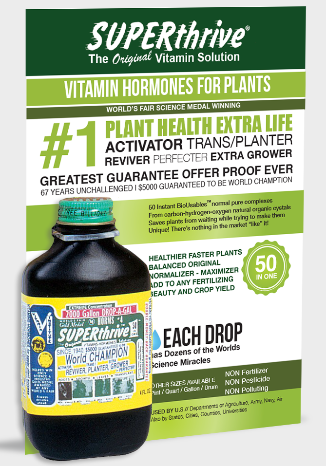
Now… they just gotta work on the actual label on the product!