Design 101 ~ Negative Space
In my previous articles, I speak many times that a good design will consist of several things. Good typography, use of images, relevant content, color theory etc. But we must not forget the glue that holds it all together. Negative space.
What is Negative Space?
You may have heard it before. White Space. Negative Space. Both are the same thing. It is essentially the space that is NOT used in a design. Basically it’s “The Nothing”. It does not have to be white. It could be any color. So for the sake of simplicity, let’s call it negative space for the rest of this article.
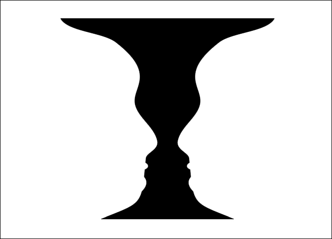
Below is the infamous image: Face or Vase? If you see a white vase, then the negative space is the black area surrounding it. If you see 2 black face profiles, then the negative space is the white space in between the 2 faces.

Here is the same picture with the colors inverted.
If you see a black vase, then the negative space is the white area surrounding it.
If you see 2 white face profiles, then the negative space is the black space in between the 2 faces.
Here is the same picture with a color thrown in.
If you see a white vase, then the negative space is the orange area surrounding it.
If you see 2 orange face profiles, then the negative space is the white space in between the 2 faces.

Here are 2 examples of web design that utilizes negative space.

Why is negative space so important?
Negative space gives the design “breathing room”. It gives clarity, focus and balance to the design. The use of negative space is equally just as important as the space that is used where the design elements are.
Imagine yourself entering a home with an owner who is a hoarder. How do you feel?
Imagine yourself entering a clean minimalistic home where everything has its place. How do you feel?
The same goes with design.
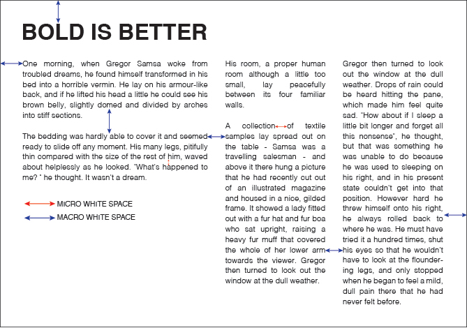
Micro vs. Macro white space
Micro White Space: This is the space that is used in between smaller areas such as spacing in between text and words.
Macro White Space: This is the space that is used in between larger elements of design, such as spacing in between columns, margins, and blocks of content in web design.
Cheap vs Luxury
You will notice that direct mail marketing ads and beginner designers will try to use up as much real estate because they feel they need to get the most bang for their buck. But they are wrong.
Take a look at 2 ads below and tell me which one looks bargain basement and which one you would probably pay $120 for a haircut. You do not need to fill up every nook and cranny to have an effective message.


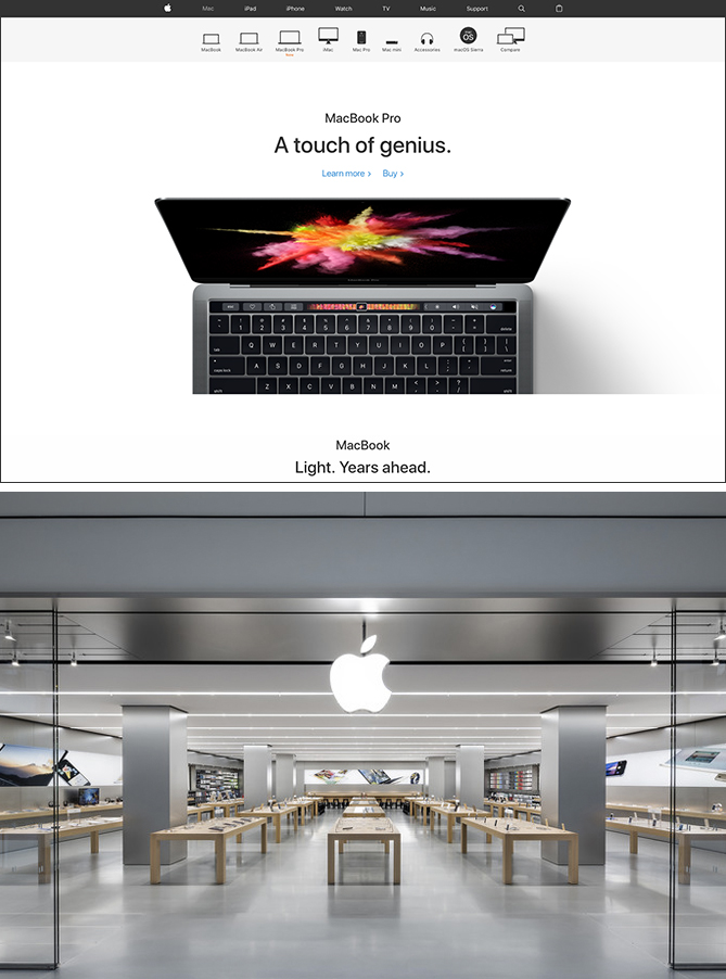
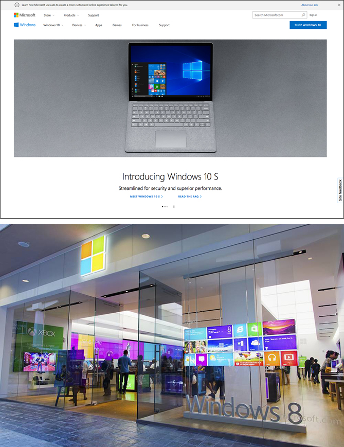
Apple vs. Microsoft
An excellent example is the comparison between Apple and Microsoft. I have used a PC for almost 20 years, and worked on and off a Mac in University and in the corporate world, and have used a Mac for the last 5 years so this section is not biased in any way. For a comparable view, I have taken 2 screenshots from both their websites main product pages that are above the fold.
Apple’s website is super clean with lots of negative space. You can see this in their product design, their storefronts, their product layouts in the stores, and their use of color (well lack of) in the stores. Everything about their brand is just… simple.
With Microsoft, they use negative space, but not without alot of clutter. For example, the top header bar that explains their ad policy, the bottom right pull out for site feedback, the top right clutter for the sign in, search and shop button which doesn’t line up aesthetically. Their storefront design does mimic the sleekness of Apple, but the big difference is that they use alot of color. It almost seems like they do this to entice customers whereas Apple’s products speak for themselves and don’t need all the bling to go with it.
Another great example of maximizing real estate to the next level are Chinese take out menu’s. They are notorious for cramming in everything under the sun. And, there’s nothing that they CANNOT make! And who doesn’t love Chinese Restaurants run by moms and pops! (I grew up on this food!).
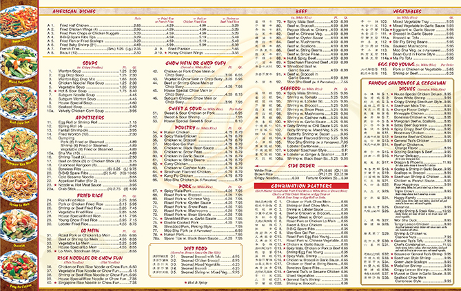
In comparison, restaurants like Momofuku, caters more to the younger, hipper crowd and their design is slick and clean and their ramen noodles definitely cost more. If you haven’t watched David Chang’s Mind of a Chef, you should. But I can bet you that my Chinese Grandma (whom I miss dearly) would have picked the 1000 menu item over the 5 choice $15 ramen noodles on any day. Negative space design in a menu would not have changed her mind.
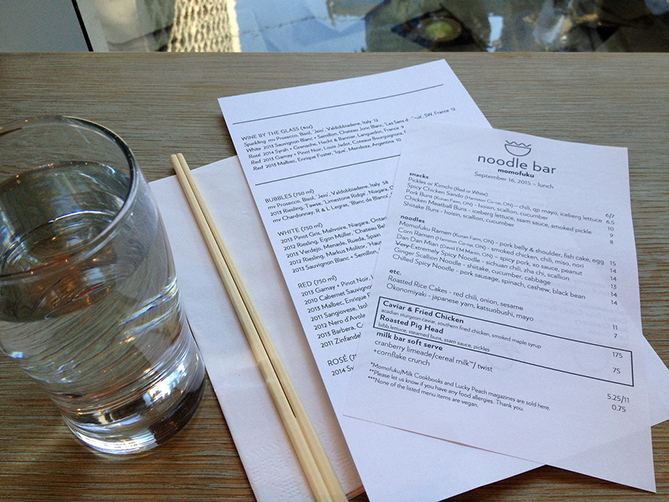
Thank you to Xiao Eats for graciously letting me use her photo!
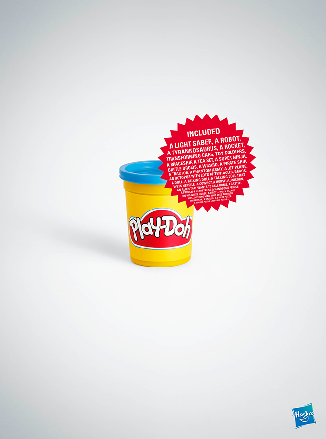
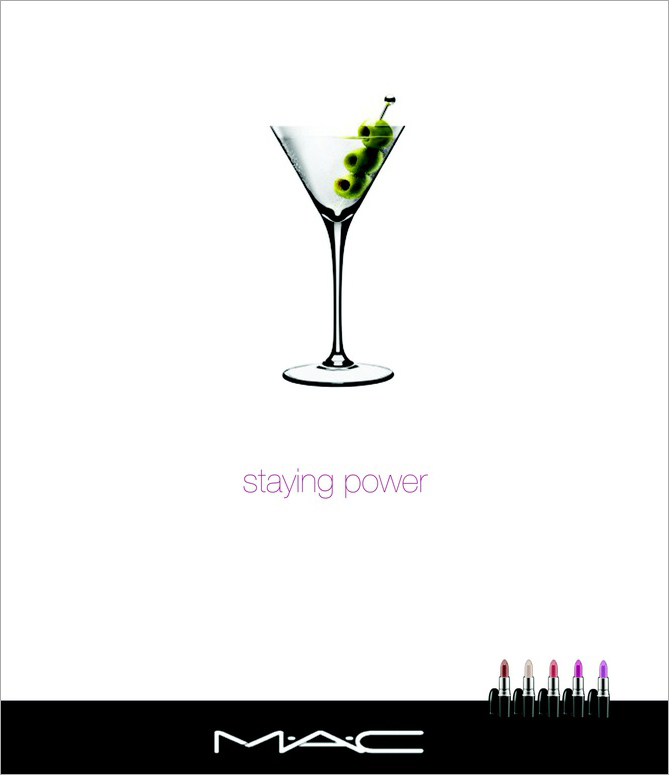
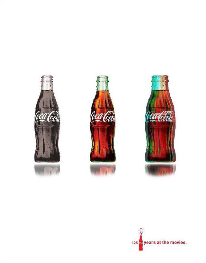
More examples of big brand ads that use lots of negative space.
Less is More
So what is your take? Do you think less is more? Will you try to use more white / negative space in your next ad? Give it a try and see how effective your next ad can be!