Kerning, Leading, Tracking, Widows, Orphans, Rags and Rivers
Ya, the title of this post is pretty funny. What on earth is that you say? Well, if you are a typography guru, then you will understand. In my third year of University, I took a mandatory course in Typography. I’m not quite certain how my professor did it, but he managed to spend half a year just talking about what kerning and tracking was.
You will see below my guide to what all this means. But why are all these things essential? Good design requires that all these rules be met. Sure, design software has the ability to auto kern or track, but really, it’s “automated”. Nothing will compare to a real live human being kerning and tracking by his own eye with years of experience under his belt. Just like a good butcher.
Here is my guide to Kerning, Tracking, Leading, Widows, Orphans, Rags and Rivers
Kerning
The spacing between characters.

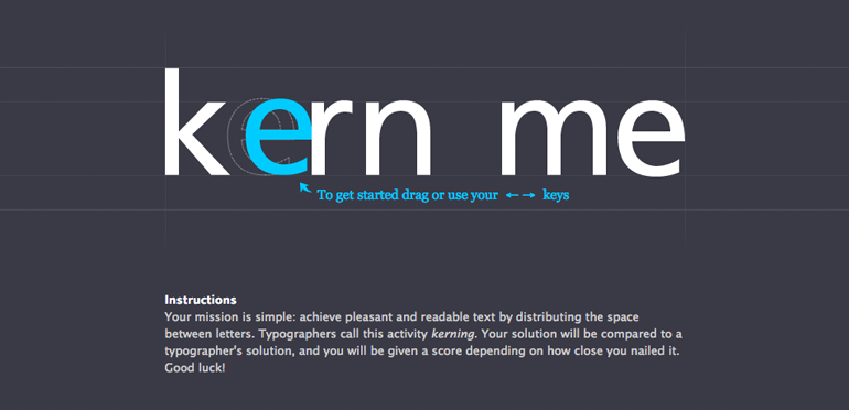
Want to learn how to kern? This Nifty Little Website lets you practice to your heart’s content. It even scores your ability to kern.

Tracking
The spacing between groups of letters.
![]()
Leading
The spacing between base lines.

Widows
A lonely ending paragraph at the top of the second column.

Orphans
A lonely word separated from the rest of the paragraph.

Rags
Really horrendous and ugly uneven vertical margins.

Rivers
Gaps that run through the white areas.

So, how do we fix all this stuff?
It comes with practice. If you are a designer or a fellow OCD’r, usually this stuff just glares right out in front of you. But it should be fixed before anything goes into print or publication, or you will have fellow designers judging and shaming you (I’m not one of those. Well, maybe.)