6 Designer Tools to Have in Your Arsenal
As a designer, there are resources and tools that you gather throughout your career to make your life easier. Here are my top 6 Designer Tools that I use (some for years and in no particular order).

 1. Dummy Text Generator
Dummy text or what is more commonly known among designers as ‘Lorem Ipsum’. It is text that is used in the publishing industry or by web designers as “filler content” until they get actual final copy from the client. This helps aid in visuals when laying out a design. I once had a client who thought I translated copy to some form of Elvish until I had to explain, that no, this is to help you visually see the layout, so please send me copy or people will think you are publishing The Lord of the Rings: Alternate Version.
I have been using Blind Text Generator for years and I love it because their website is super simple and it gives you a variety of options from selecting how many paragraphs you need to the exact number of characters you need. Just copy and paste it into your layout.
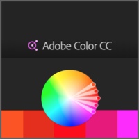
 2. Adobe Color CC
Before designing anything, you need a Colour Scheme. And to help with that, I use the Adobe Colour Wheel. You can create color schemes with the colour wheel or browse thousands of color combinations created from within the Kuler community. Looking for a colour scheme that is “earthy“? Look no further. How about a soothing and relaxing scheme for a spa?
You can also present options to your client and allow them to choose one to their liking. I suggest not giving them the thousands of options, but rather, your curate a few that you like and present them separately. This way, you still have control of the outcome. Otherwise, you may end up with a horribly chosen colour scheme that you cannot talk your client out of.
I also go into detail in another post about The Psychology of Colour. Give it a quick read.

3. Unsplash
I use to scour the internet for weeks trying to find a really good free stock photo. Until that is, I came across Unsplash a couple of years ago. This is by far the best free stock photo site ever created and it has grown into an industry leading photography community and now passes 500,000 photos.
Unsplash is great if the client cannot produce their own original photography. There is still a uniqueness about the photos on there. When you have been in the industry for a long time, you eventually start recognizing certain photos as stock photos, especially when going into shopping malls and stores. As with any stock photo, choose wisely and carefully for your client.
If you wish for your client to choose, Unsplash also has a feature where the client can curate a bunch of pictures, email you the link and you choose whichever one fits best for their project.
They also have a MAC/Windows app that rotates between random pictures for your desktop AND also a Google Chrome extension. Each time you open a new tab, Unsplash Instant will show you a beautiful high resolution photo from Unsplash, free to download and use however you want.

4. HTML
When you have an 13 year old in 354 after school activities, a 3 year old who eats 55 times a day, a house to clean, food to cook, laundry to wash, and a husband who’s work is an hour away by commute each way, there’s little left in the noggin to remember if the <th> comes before the <tr> or <table>.
This is where HTML.com comes in handy when you need a quick pick me up code because your brain has farted just a little bit too much. Here is a post I did on Basic HTML Tags.
Update: I was recently contacted by Richard over at HTML.com and he mentioned that they started a sister site over at Digital.com with an even better cheat sheet. It has been brought up to date with HTML5 and an interactive layout to appeal to newbies & experienced webmasters alike. Definitely worth the check out.
 5. Typeface 2
I used to use My Fontbook, however by the time my fonts start loading on my computer, I could have done all of the above, clean the house, do the laundry AND commuted for my husband before one font even shows up in the window.
So recently, I downloaded a free trial of Typeface 2 (MAC only), and so far, it’s doing supremely well. So well in fact that I might purchase it. Every designer needs a font manager because you have all your fonts laid out and you can see how your copy looks in one sitting, kinda like Google Fonts. Because quite frankly, scrolling through fonts in any given design program one by one is enough to make you want to stop designing altogether.
So definitely consider using a Font Manager.

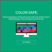
6. Color Safe
I was just recently introduced to Color Safe by my partner in crime, Cher (ahem developer nerd), whom I work with over at Creative Lounge.
She kept telling me that my periwinkle blue wasn’t approved as a web safe colour, and that the WCAG Police may come and arrest me. I was like “Huh? Why?! Who are the WCAG? Are they the FBI?”.
She said because my foreground and background choice of colours don’t have a 4.5:1 contrast ratio at Level AA (sorry Cher, I still don’t know what this means, remember laundry, a teen and a pre-schooler?).
Nevertheless, I must take heed to her advice lest I am held responsible for any further deterioration to any given internet surfer’s macular degeneration, so I have bookmarked this website for further reading.
But if I were you and you are a web designer, please use this site or else you will be judged by other web designers and developers.
So there you have it, try any of these resources and hope you have fun designing.