Design 101 ~ The Design Grid
A Design Grid is an invisible grid on your art board. If you follow the rules of a Design Grid, then your design won’t look like this.

I have overlaid a grid on top of it and if you look at the ad closely, you can see that NOTHING lines up anywhere.
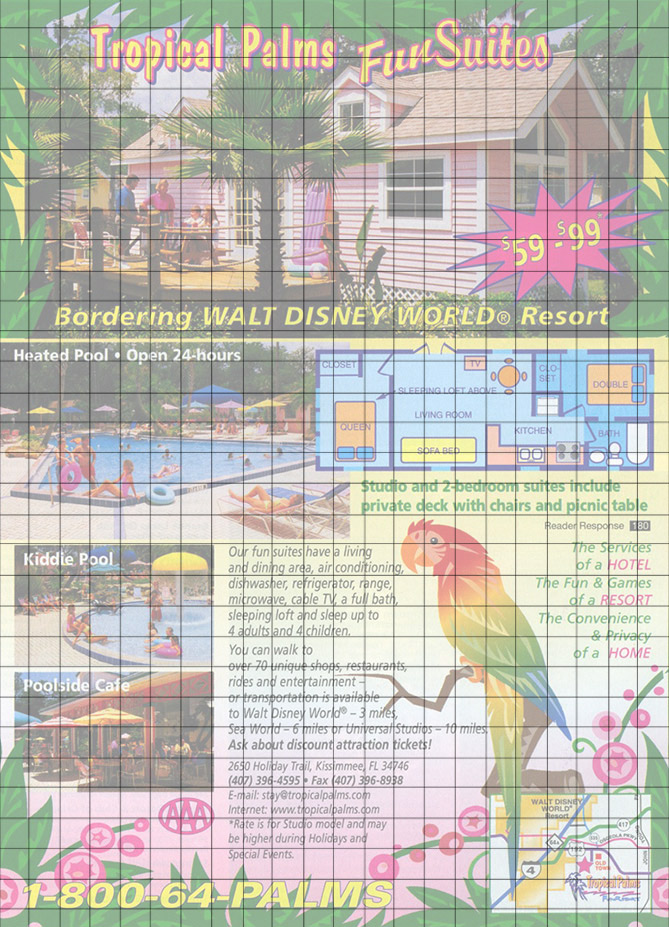
There are several things gone wrong with this ad, like use of color, typography and of course, there is no Design Grid.
Why are Design Grids so important?
There are several reasons:
- Final design will be aesthetically pleasing.
- Changes will be easier.
- Your content will be organized.
- Your ads will be more effective.
- Your audience will thank you.
Always start your design by implementing a Design Grid!
No ifs ands or buts.
How to create a Design Grid
It is really easy to create a Design Grid. If you are using Adobe Illustrator, drag your guides out from the ruler and place them on the artboard. Then lock your guides by going to View / Guides / Lock. Then design away! You don’t need to do a detailed Design Grid like the one below where it’s every half inch. When you get more accustomed to designing, eventually you will not even use a grid, just your eye and will only use a guide to line something up.
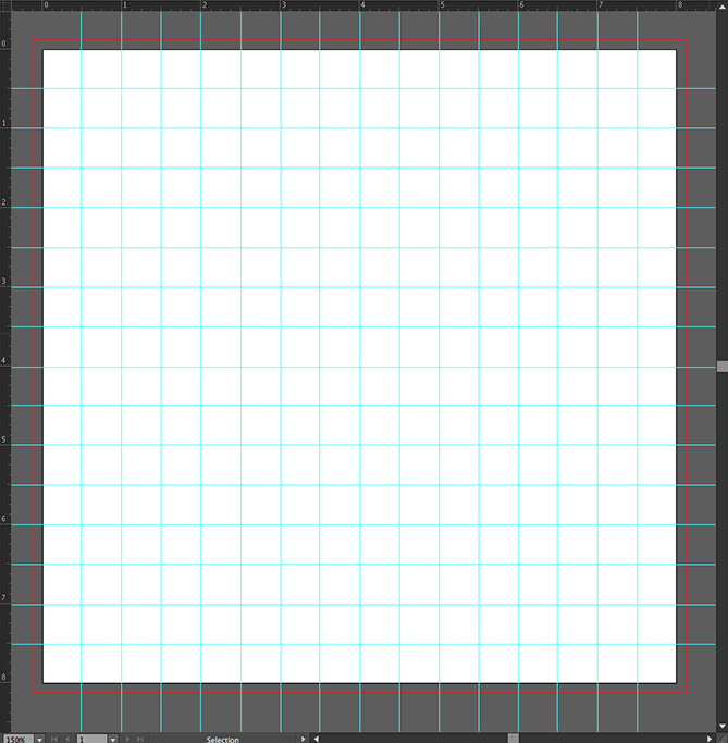
Creating a design layout onto a Design Grid
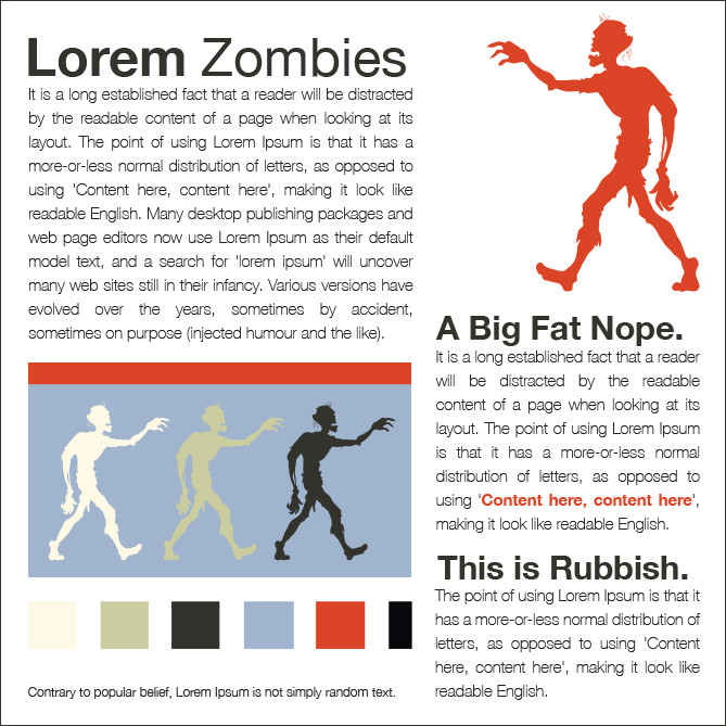
Here is an example design I did that follows a Design Grid.
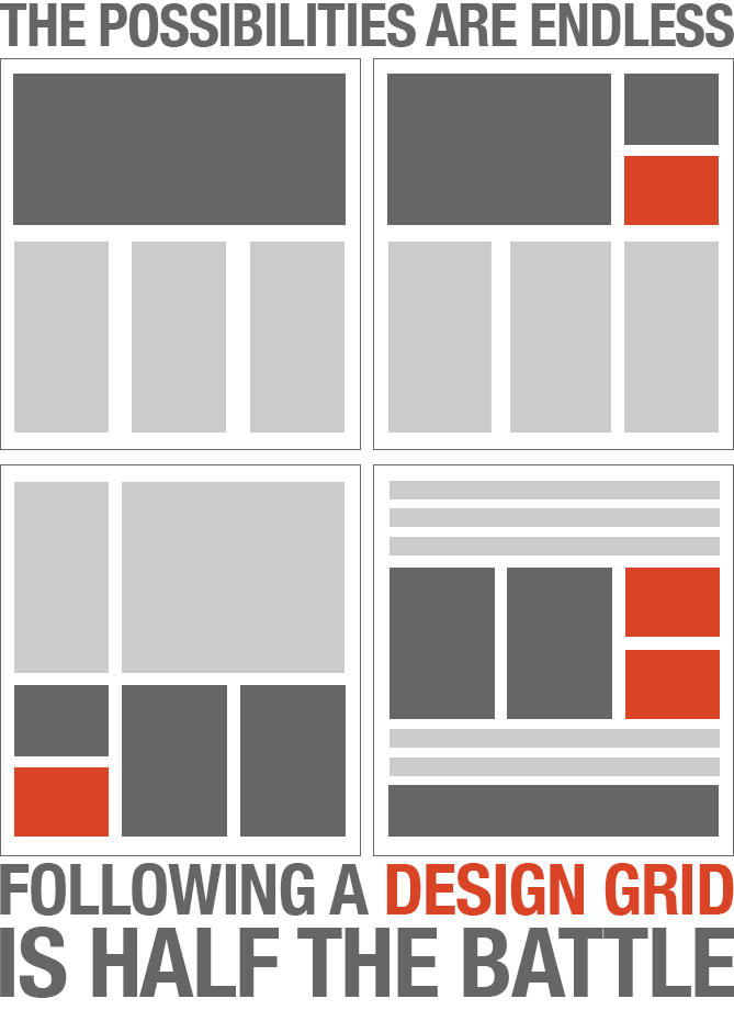
Some examples of common Design Grid layout.
Design Grid ~ Print vs Web
It is much easier applying the Design Grid on print than on web because you have more control. Mainly this is due to type. On the web, text is not easily manipulated and controlled and you cannot kern or track unless you do it in CSS. Also different browsers and different versions that support one thing and not the other just makes it all into a big gigantic headache. So my rule of thumb when doing text copy on the web (without trying to rip out my hair) is to ensure that I have good web fonts, good paragraph spacing, and good images. Honestly, nobody will care if your letter A is too close to the V. Well, only other designers will. The rest of the users will only want information.
But do try to apply the same concepts and principals onto a website and don’t forget you need to also think of how it will affect the responsive layouts as well.
Final Thoughts
At the end of the day, using a Design Grid is the first part of creating a design. You will also need to choose amazing images, fonts, use correct principals of typography and write compelling content to produce an overall stellar design.