About marinaduque

Hey! My name is Marina, and I'm a Toronto based Web & Graphic Designer, Artist and Illustrator with over 20 years experience.
27 February 27, 2026

Romero Britto Painting Inspiration

2026-02-28T15:45:14+00:00By |Art|

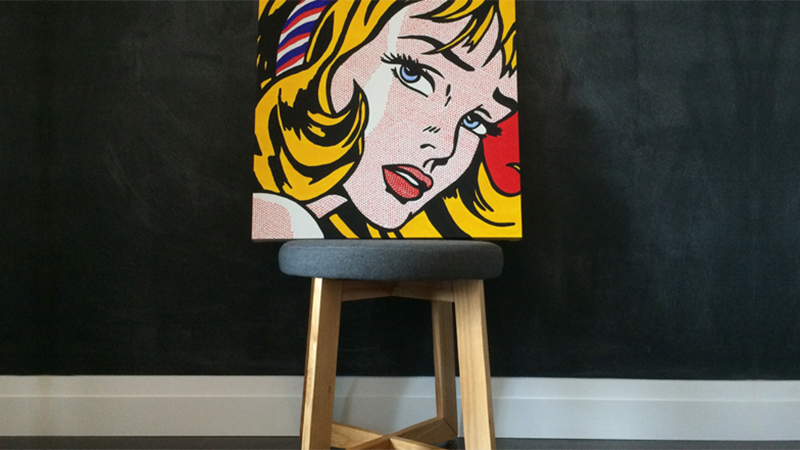
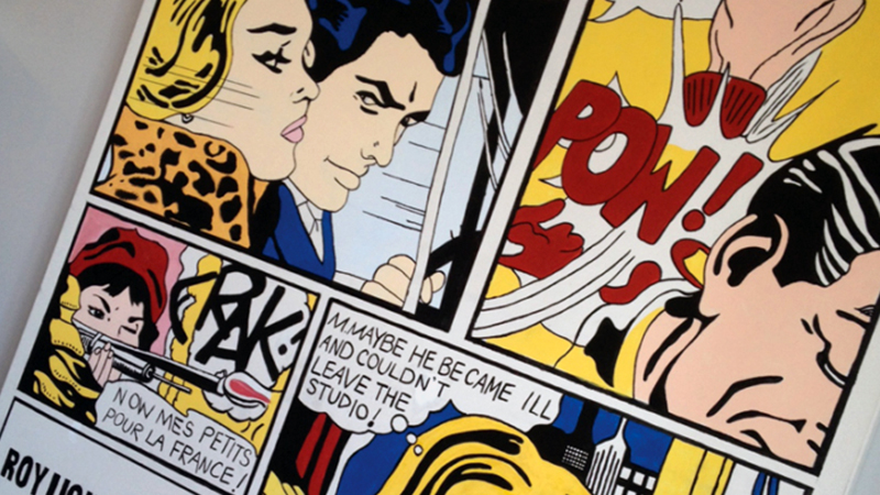
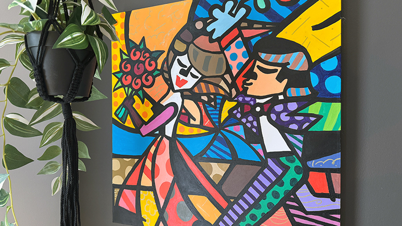
Romero Britto Painting Inspiration I first encountered a Romero Britto painting aboard the Disney Dream Cruise. It was a showcase of his Mickey Mouse project. After that, I became smitten with his work and ran into his stuff again at a local Christian bookstore where his art was now on ceramic mugs and notebooks of the sort. His style is pop art, an era which I love as you can see from the two Lichtenstein paintings I did previously. I love the colour and bold lines. So in my 8th month of pregnancy, I decided this would be the last painting [...]

17 February 17, 2026

Roy Lichtenstein’s Girl with Hair Ribbon

2026-03-03T14:49:17+00:00By |Art|

How to Paint Roy Lichtenstein's Girl with Hair Ribbon Check out the painting I did below of Roy Lichtenstein's Girl with Hair Ribbon. I toyed with the idea of doing actual Benday Dots on her face by using circular stickers, and then thought an easier way out was just to colour her face nude, like alot of other replicas do, but instead, I used a red sharpie and went nuts on her face. Check out the other painting I did of Roy Lichtenstein on a 4 x 6 canvas. About Roy Lichtenstein American artist Roy Lichtenstein (1923 - 1997) was born [...]

15 February 15, 2026

My 4×6 Foot Roy Lichtenstein Painting

2026-02-28T15:45:28+00:00By |Art|

My Roy Lichtenstein Painting Roy Lichtenstein is one of my favourite artists. You can tell because I painted another one of his paintings here called "Girl with Hair Ribbon". About Roy Lichtenstein American artist Roy Lichtenstein (1923 - 1997) was born in New York City and grew up on Manhattan's Upper West Side. He was one of most influential artists in the pop art movement. His style largely derived from comic strips, portrayed the trivialization of culture endemic in contemporary American life. Using bright, strident colors and techniques borrowed from the printing industry, he ironically incorporated mass-produced emotions and objects [...]

20 July 20, 2025

Serif vs Sans Serif⁠ Fonts

2026-02-28T15:47:40+00:00By |Graphic Design|

Serif Vs Sans Serif Serif and sans-serif fonts are two distinct typographic styles that differ in their appearance and usage. Serif fonts are characterized by small decorative lines (serifs) at the ends of characters, such as Times New Roman or Georgia. These serifs create a more traditional and formal feel, making them suitable for printed materials like books, newspapers, and documents, where readability and legibility are paramount. On the other hand, sans-serif fonts, like Helvetica or Arial, lack these decorative lines and present a more modern and minimalistic appearance. They are often preferred for digital media, websites, and screens [...]

18 July 18, 2024

What is Dummy Text / Lorem Ipsum⁠⁠?

2026-02-28T15:47:20+00:00By |Graphic Design|

What is Dummy Text / Lorem Ipsum⁠⁠? Dummy text or what is more commonly known among designers as ‘Lorem Ipsum’. It is text that is used in the publishing industry or by web designers as “filler content” until they get actual final copy from the client. This helps aid in visuals when laying out a design. I once had a client who thought I translated copy to some form of Elvish until I had to explain, that no, this is to help you visually see the layout, so please send me copy or people will think you are publishing The [...]

20 July 20, 2023

Optical Alignment

2026-02-27T20:00:53+00:00By |Graphic Design|

What is Optical Alignment?⁠⁠ When your composition is aligned via math, but something about it still looks off and it drives you completely insane.⁠⁠ That's when Optical Alignment comes into play.⁠ By using what? You guessed it, your eyes.⁠⁠ Apply these principals to things such as large title copy and large headers.  

20 July 20, 2023

RGB / CMK / SPOT COLOUR

2026-02-27T20:13:32+00:00By |Graphic Design|

RGB / CMK / SPOT COLOUR! What's the Difference? RGB (Red, Green, Blue) is used for screen, web, digital⁠⁠ CMYK (Cyan, Magenta, Yellow, Black) is used for print⁠⁠ SPOT COLOUR (Pantone Matching System - PMS) is used for print⁠⁠

20 July 20, 2023

CMYK vs SPOT COLOUR

2026-02-27T20:20:09+00:00By |Graphic Design|

CMYK vs SPOT COLOUR: Which one should you use?⁠⁠ CMYK - CYAN / MAGENTA / YELLOW / BLACK⁠ Also called 4 Color Process, these colours are mixed together and applied on paper with thousands of tiny dots on a paper to create an image. Endless Colour Combinations⁠ More Realistic Design⁠ The only way to reproduce a full coloured photo⁠ Less expensive due to the printing process using less plates.⁠ Ability to reproduce most PMS (Pantone) spot colours⁠ SPOT COLOUR (PANTONE MATCHING SYSTEM / PMS)⁠ No colours are mixed. Think cans of paint, with specific numbers assigned to over 1800 colours. [...]

18 July 18, 2023

Where to Find a Really Good Logo Designer

2026-02-27T20:40:32+00:00By |Graphic Design|

Where to Find a Really Good Logo Designer Here are 6 places to find good Logo Designers. 1. Word of Mouth⁠⁠ Nothing beats the traditional word of mouth referrals!⁠⁠ @yourfriendwhohasreallygooddesigntaste⁠⁠ ⁠⁠ 2. Dribbble⁠⁠ Dribbble is an online community of graphic designers, web designers, logo designers, illustrators etc. and the go-to resource for discovering and connecting with designers and creative talent around the globe.⁠⁠ @dribbble⁠⁠ ⁠⁠ 3. Upwork⁠⁠ You will find many talented freelance designers on Upwork. Services ranging from Logo Design, to Video Editing, to WordPress and SEO.⁠⁠ @upworkinc⁠⁠ ⁠⁠ 4. LinkedIn⁠⁠ LinkedIn is probably the #1 for business networking and connections, [...]

18 July 18, 2023

Breathing Room

2026-02-27T20:42:56+00:00By |Graphic Design|

Breathing Room The space that is in between design elements.⁠⁠ Just like a cluttered living room full of tchotchkes can make one feel anxious with the dire need to run away 🏃🏻‍♀️, so can a cluttered layout.⁠⁠ ⁠⁠ Easy to read layouts are easy on the eyes. If you have too much happening, chances are, your reader would have lost interest at first glance. Remember, nowadays, people don't even read, they scan.⁠ 🙋🏻‍♀️⁠⁠ ⁠⁠ Make sure you leave plenty of margin and breathing room all around your layout. You do not need to write a novel to get a few [...]

Go to Top