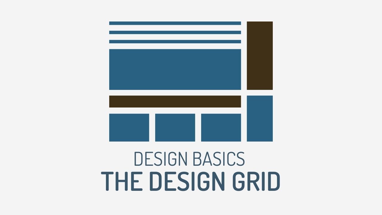
About marinaduque

Hey! My name is Marina, and I'm a Toronto based Web & Graphic Designer, Artist and Illustrator with over 20 years experience.
15 May 15, 2017

The Design Grid

2026-02-28T15:50:09+00:00By |Entrepreneurship, Graphic Design, Illustrator, Marketing, Photoshop|

Design 101 ~ The Design Grid A Design Grid is an invisible grid on your art board. If you follow the rules of a Design Grid, then your design won't look like this. I have overlaid a grid on top of it and if you look at the ad closely, you can see that NOTHING lines up anywhere. There are several things gone wrong with this ad, like use of color, typography and of course, there is no Design Grid. Why are Design Grids so important? There are several reasons: Final design will be aesthetically pleasing. Changes will be easier. Your content will [...]

11 May 11, 2017

Designing a Product Label

2026-02-28T15:50:04+00:00By |Entrepreneurship, Graphic Design, Illustrator, Website Design|

Case Study ~ Creating a Product Label Design Going back to my last post on where I ask If Your Ads are Effective, this post will now show you how to bring your message to life through design. Taking the product label from my previous post, I am going to redesign the front of the label only. As mentioned, the problems with this design was complete information overload . This needs to be streamlined and alot of the information should be housed on their website and is not necessary on the product label. So, what are the most important pieces of information? Front [...]

9 May 9, 2017

Is Your Ad Design Ugly?

2026-02-28T15:30:05+00:00By |Entrepreneurship, Graphic Design, Illustrator, Marketing, Photoshop, Website Design, WordPress|

Is Your Ad Design Ugly? Is your ad design ugly? What truly makes a great design? An effective design or ad is not just all about looks. There are 3 main components when designing anything whether it be a simple web banner, a lead sales page, a corporate brochure, or even something as simple as a business card. Message Delivery Aesthetics Message Define crystal clear what message you are trying to convey. Do not leave anything up for assumption. Why? Because people don't have time to waste and by 8 seconds, they would already have moved on. Is this sad? Yes. But [...]

4 May 4, 2017

The Psychology of Color

2026-02-28T15:49:38+00:00By |Art, Entrepreneurship, Graphic Design, Home Design, Illustrator, Photoshop, Website Design, WordPress|

The Psychology of Color in Marketing and Branding If I were to play a song for you that you listened to while growing up, there is no doubt that you would remember all the words AND the feelings and emotions that were associated with it. For example, assuming you are my age, and I say "INXS, Never Tear Us Apart", what fond memories do you have? OMG! I remember when I slow danced in Grade 6 to that song! Am I right? Well, imagine that with color. We know that Red is Love, Purple is Royalty, Blue is Calming and [...]

25 April 25, 2017

Design a Banner that Stands Out

2026-02-28T15:49:32+00:00By |Entrepreneurship, Graphic Design, Illustrator, Marketing, Photoshop, Website Design|

Design a Banner that Stands Out In my previous post, I discussed which Web Banners are Considered the Top 5 Most Effective Sizes according to Google. In this post, I will show you how to effectively design a web banner that is both eye catching and one that will get your message across. Seeing that you have very limited real estate when it comes to your web banner given by the sizes, you need to keep it really clean and simple. What is the purpose of your web banner ad? Is it a promotion that is going to expire? Is it [...]

21 April 21, 2017

Top 5 Web Banner Sizes

2026-02-28T15:52:10+00:00By |Entrepreneurship, Graphic Design, Marketing, Photoshop, Website Design, WordPress|

Top 5 Web Banner Sizes Below are the standard web banner sizes that you can implement on any website. The ones that are highlighted in Pink are considered the top 5 most effective web banner sizes according to Google. Leaderboard (728 x 90 pixels) Large Rectangle (336 x 280) Half Page Banner (300 x 600) Medium Banner (300 x 250) Large Mobile Banner (320 x 100) Full Banner (468 x 60) Half Banner (234 x 60) Vertical Banner (120 x 240) Wide Skyscraper (160 x 600) Skyscraper (120 x 90) Button 1 (120 x 90) Button 2 (120 x 60) [...]

31 March 31, 2017

Fiverr. Good or Bad?

2026-02-28T22:26:20+00:00By |Entrepreneurship, Graphic Design, Marketing|

Fiverr? I remember several years ago, my snooty design friends and I were scoffing at the idea of crowdsourcing and logo design contests. How dare they! How dare they devalue us designers! We were always taught to turn away spec work. But let's think for a minute. Are you really going to pay a plumber $5 to fix your clogged drain? Or better yet, tell him, "I want to see what you can do with my drain. If I like what I see, then I will pay you." Um. No! I remember last year, I had to write a cheque [...]

22 March 22, 2017

Kerning, Leading, Tracking, Widows, Orphans, Rags and Rivers

2026-02-28T15:31:19+00:00By |Graphic Design, Illustrator|

Kerning, Leading, Tracking, Widows, Orphans, Rags and Rivers Ya, the title of this post is pretty funny. What on earth is that you say? Well, if you are a typography guru, then you will understand. In my third year of University, I took a mandatory course in Typography. I'm not quite certain how my professor did it, but he managed to spend half a year just talking about what kerning and tracking was. You will see below my guide to what all this means. But why are all these things essential? Good design requires that all these rules be met. Sure, design software has [...]

22 March 22, 2017

What is Mechanical Paste-Up?

2026-02-28T15:31:33+00:00By |Graphic Design|

What is Mechanical Paste-Up Mechanical Paste-up refers to a method of creating or laying out publication pages that predates the use of the now-standard computerized page design desktop publishing programs. Completed, or camera-ready, pages are known as mechanicals or mechanical art. Wikipedia Here. Way Back When Back in 1994, I applied for the opportunity as a co-op student to work at large bank in their graphics department. For a whole year, I was shown the in’s and out’s of graphic design, “mechanical paste-up” and introduced to the world of designing on a computer. Back then, Corel 3.0 was the program [...]

27 February 27, 2017

Screen Resolution vs Print Resolution

2026-03-03T19:13:11+00:00By |Graphic Design, Illustrator, Photoshop, Website Design|

Screen vs Print Resolution Infographic If I had a nickel for every time a dear client sent me a 48 kb file photograph to insert into their business card, I can confidently say that I would be taking a yearly trip to Fiji. Here is my simple explanation on Screen Resolution vs Print Resolution in my infographic. Of course, you can google so many different theories that explain it much deeper and thoughtful than I, like this, this and this. Screen Resolution Purpose: Designing something for the Web (There is less information per square inch) Colours: RGB (Red, Blue, Green) Resolution: 72 [...]

Go to Top